I started working on “developer art” for my main character Eris so I can make her run around and jump on things. This was driven by a lot of work on state machines which may be a separate post later on. There are a zillion videos out there on how to pixel art and how to colors and how to draw, but they pretty quickly become overwhelming. Art is, by its very nature, rather subjective. So unsurprisingly how to make it videos are too.
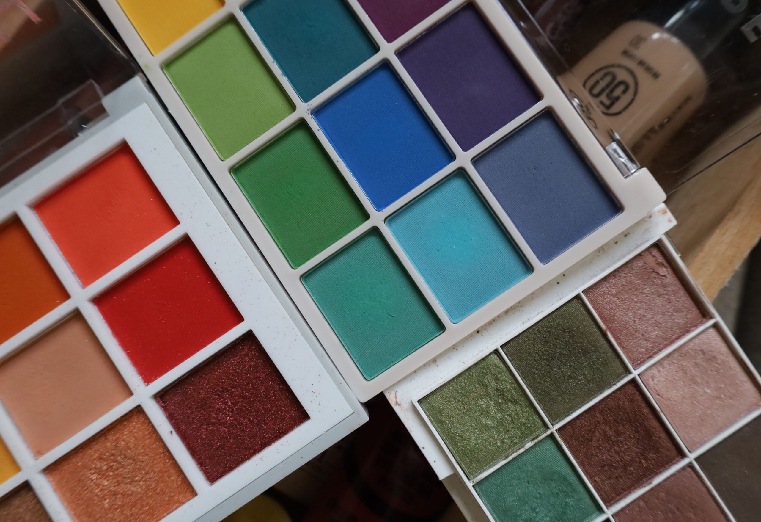
There are lots of ways to choose colors for your pixel art. You could literally just pick a color every time you want a color. On modern hardware that can mean picking a color from the millions or billions of choices that are available. It really is the ultimate paint kit, but that’s actually less of a good thing than it sounds like. If you can pick ANY green you want out of the thousands of variations of green, what are the odds of picking the same green again next time? If you can pick all of the greens you want, what keeps your art from looking kind of muddy because you picked too many greens? What keeps Eris’ space suit from being a different green on each frame of her animation?
You can also have the problem of things not standing out properly against the background. Imagine a character in a green dress walking through a green field of tall grass. How do you keep from making her dress blend into the waving blades of grass and making it hard to see her at all? What if you change the color of her dress to make it stand out better, but the color you chose clashes oddly with the grass now? Your eyes tell you it looks terrible but you can’t always pin down why you feel that way. You just “know” it’s wrong and unappealing. These are some of the problems with color, and they need some way to fix them.
For any of the artists in the room, colors being complicated probably isn’t a surprise. I’m not really an artist but I’d like to be. On my road to artistry, I’ve bumped into color theory several times, but never really dug into it. Well, until a few days ago anyway. Now I’ve watched videos and read articles about color theory until I was confused and exhausted. At the moment, the way I can explain color theory to people is that not all colors go especially well together and it helps you find colors that look nice when they are next to each other. It also explains how light and shadow work.
Armed with all this new knowledge I have returned to the task of trying to make a few frames of a character that loosely matches my theory of the player controller state machine so I can bind graphics to the states and see how things look. This has also led me to selecting colors for the palette for Fracterebus, or some theories at least. Specifically, I am working on the palette that will color this basic version of Eris that looks nothing like the real Eris I imagine someday running around the ruined worlds of Fracterebus. That version will come a bit later when I want to try my hand at being an actual artist instead of one slapping together art that supports my current development tasks.